Printing in Black: Black vs Rich Black
It may sound silly, but in printing there are many ways to produce the colour black. Mono printing – in black only – uses a single ink, but for full colour printing we recommend using Rich Black, which is a combination of CMYK – Cyan, Magenta, Yellow, Key (Black). The extra ink produces a deeper, more saturated black colour.
The two colours might look identical on screens, but in print there will be a difference in colour, and each has their own purpose. In short, standard black is used for text, fine lines, and for economical print jobs. Rich black is used for large text, and all images in full colour printing.


Standard Black
Standard black using the CMYK colour mode is simply 100% K (Black). This is recommended for body copy and small typography in documents, as it produces sharper, more legible text. This is because the printer does not have to register 4 inks on top of each other, which can produce a slightly fuzzy edge if the inks do not line up perfectly.
For large areas of flat colour or larger text however, using 100% K will produce a colour that looks more like a dark grey, because it doesn’t have a high ink density like full colour prints.
Rich Black
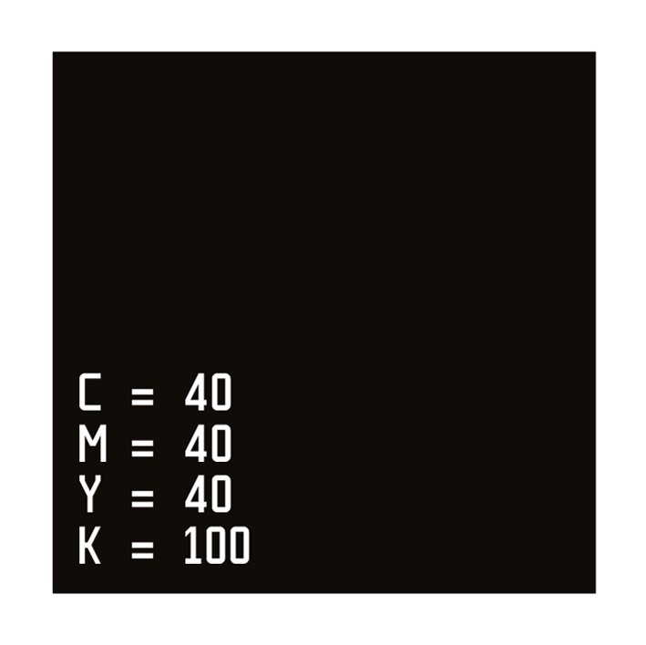
Rich black is made up of differing values of Cyan, Magenta, Yellow and Black. Rich black is used for images and text that require a deeper, darker black, as the inks are overlaid on top ofanother to increase the ink density. In printing, each colour is added to the paper separately, which can cause registration (ink alignment) issues for small text and fine lines.
Typically rich black is made up of approximate values of C=40 M=40 Y=40 and K=100 but any slight variation on these will produce a similar black. For warmer or cooler black shades, you can simply increase or decrease the Cyan and Magenta values. We don’t recommend using Photoshop’s default rich black value, which is C=75 M=68 Y=67 K=89, as this can result in oversaturated printing.